Art Everywhere, again

So. It’s that time of year again. I can’t believe a whole year has gone been since I first wrote about the Art Everywhere project. Back again this summer, I felt like I couldn’t let it drift by without commenting.

For those of you who don’t know it, basically several advertising spaces across London are filled, for a few fleeting weeks, with an array of works of art from across all genres and ages. this makes for a vastly more spectacular commute to work for the majority of us.

This year Antony Gormley created an exclusive artwork especially for the event, which is a wonderfully playful figurine:

Screenshot 2014-08-28 21.07.05


Some of my favourites from this year are:


David Hockney‘s ‘My Parents’

Screenshot 2014-08-28 21.07.50


Of course, John Constable‘s ‘Study of Cirrus Clouds’

Screenshot 2014-08-28 21.13.15


Dame Laura Knight‘s very eloquently titled ‘Ruby Loftus screwing a Breech-ring’

Screenshot 2014-08-28 21.14.05


Gilbert and George‘s ‘Exsister’ (mainly because this one was across a HUGE billboard that I see everyday on the way to work, and it grew on me!)

Screenshot 2014-08-28 21.13.38


Philippe Jacques de Loutherbourg‘s Coalbrookedale by Night’

Screenshot 2014-08-28 21.13.23


I do wonder at what sort of criteria the persons responsible use to decide what goes in, seeing as the collection is always so eclectic and varied. You can buy posters of this year’s artworks at Easy Art.

I’m pleased to say similar projects have started to spring up in other cities now, like the ‘Arte en tren’ in Venezuela.

BtkZrAzIIAAa53X


One year I’ll actually get round to participating in the competition and spotting them all! Let’s hope other cities take the hint.

Hockney Rebel

So, Today I went to see an exhibition at the Dulwich Picture Gallery of David Hockney prints. This exhibition was  recommended to me after I mentioned Hockney in a previous post, (thanks Becky!) and it became clear within the first few moments of the exhibition that I was going to come out feeling inspired and full of ideas.

These two pieces are from a series he did called ‘Weather’. The others in the series were more childlike and verging on garish, but the sunlight on the vase of flowers stood out for me as the most incredible. Those repeated slanting lines just create such an intense idea of heat. What could have been a fairly average still-life becomes energetic and sensory.

images-3


The ‘Rain’ image is also very powerful. I love the way the ink has run off the bottom, reflecting the movement of the water that it is being used to depict.

Unknown-3


Hockney drew his dogs many times. Apparently they are Hollywood dogs, because ‘they know when they are being watched’. They don’t seem to mind so much though.

1353464173


I love the colours in this print. The flailing pink arms are comical yet beautiful at the same time. I love the lilo especially and how he has drawn in the details on it’s surface.

img_hockney_1


Having been here very recently, (see previous post..) this print of ‘Two vases in the Louvre’ caught my eye. I love the colours, the stillness, the dust.

Unknown-2


These two pictures were a definite highlight. Hockney spent a lot of his time figuring out water, and how best to represent it visually. Here are two prints, the first with only the bottom layers and the second with the top layer. I love how you can almost see his thought process in how to show depth and light. Drawing water is something you could devote I lifetime to!

images Unknown


For a time Hockney became emerged in the work of the Greek poet Constantine Cavafy, who spend much of his life in Egypt writing about the homosexual subculture that existed in Alexandria. He created a series of illustrations for the poems, partially ‘Ithaca’. They are not over erotic but subtly so, and I like Hockney even more for this. He is being gentle with his subject matters because he cares about them. Most of this series (the ones exhibited in this exhibition anyway) were calm, almost domestic scenes. I love the way he etches hair.

images-1

images-2


More examples of his skills as a printmaker:

images-4 Unknown-1


On one of the descriptions was a phrase describing his style of printin-making that stuck in my mind after the exhibition: “..light-hearted in spirit but serious in intent.” I think this is true of my own work sometimes. He used a form of printing called ‘lithography‘ in many of his works which I am determined to learn how to do. This exhibition has re-invigorated my passion for the many forms of printing. Sadly the workshop that the gallery ran alongside the exhibition was sold-out before I cottoned-on to it!

The exhibition is running until the 11th of May, and I would highly recommend a visit.


Tate Britain

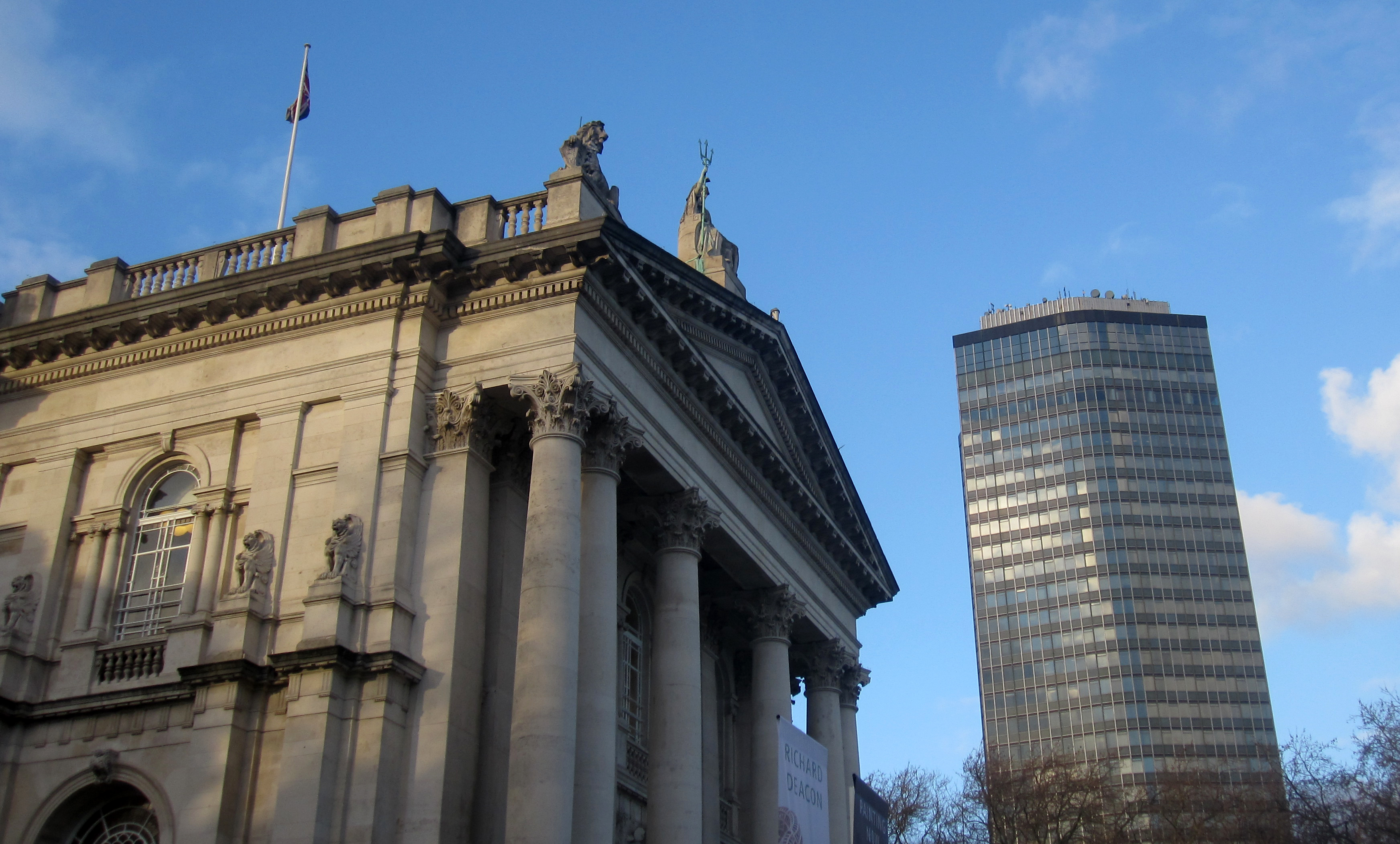
So. One bright and breezy Tuesday I decided to go and visit the newly refurbished Tate Britain, to check out the changes. Perhaps I had been influenced by the persistent advert campaign on the tube declaring ‘you must come see’, or maybe I was just looking to be inspired. A bit of both most likely.

First impressions – it is light, bright, and lofty. Well, it would be if there hadn’t been a gaggle of school children clutching fresh sketchbooks.

tate 1

roof


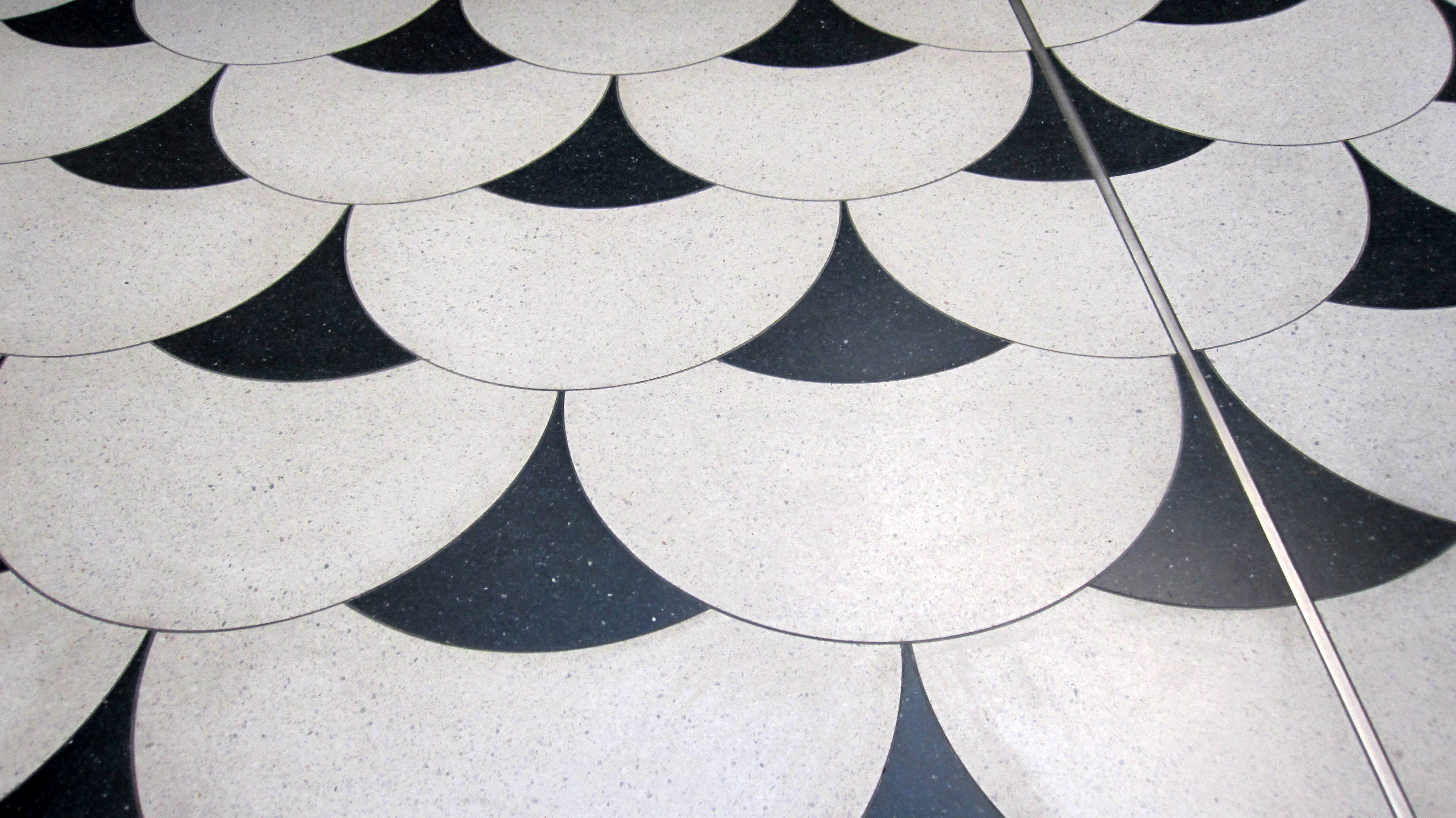
I particularly loved the overlapping tile design on the floor:

floor


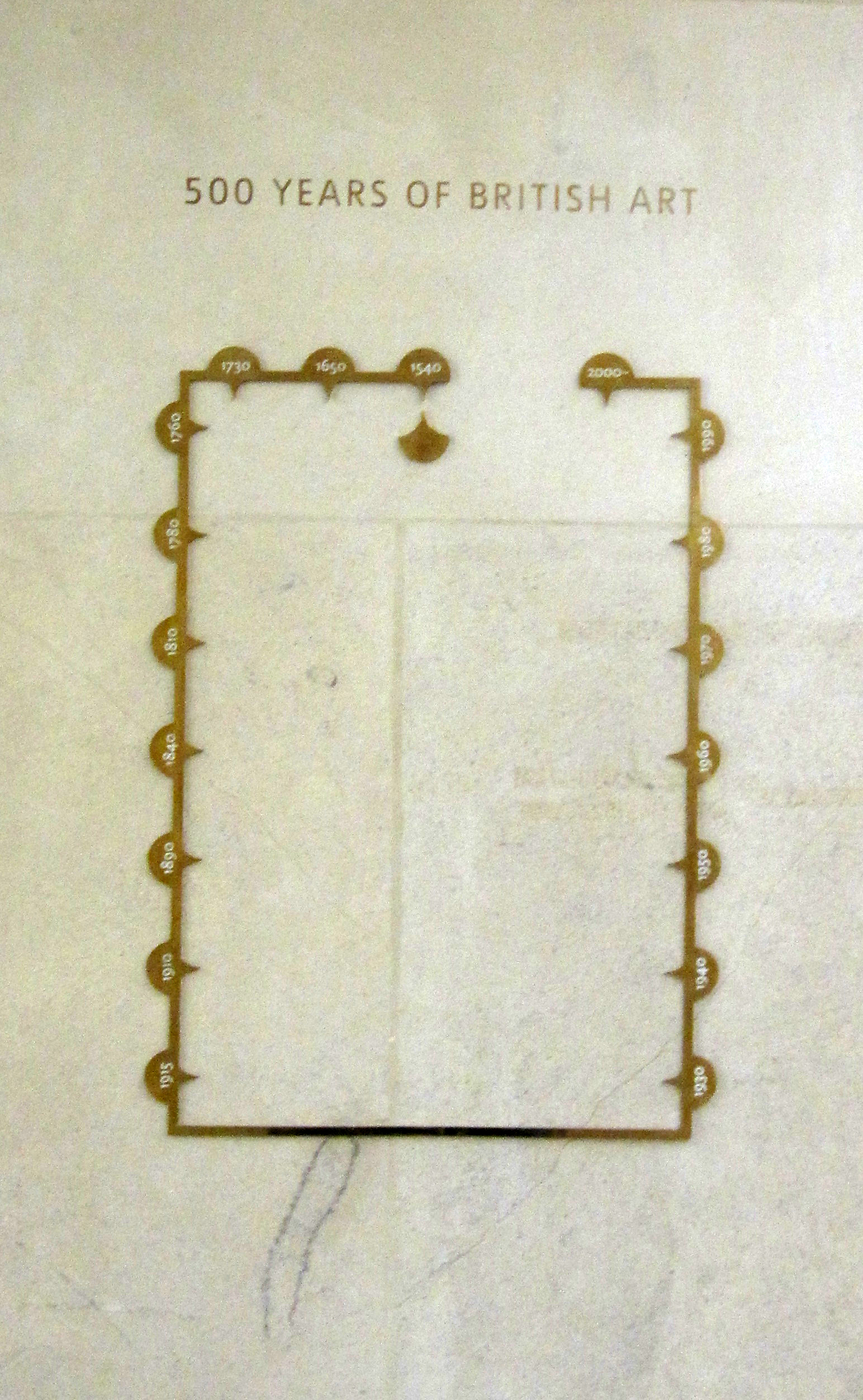
And this beautifully simplistic map to help with orientation, that brought to mind images of a lift in 1920s New York.

map


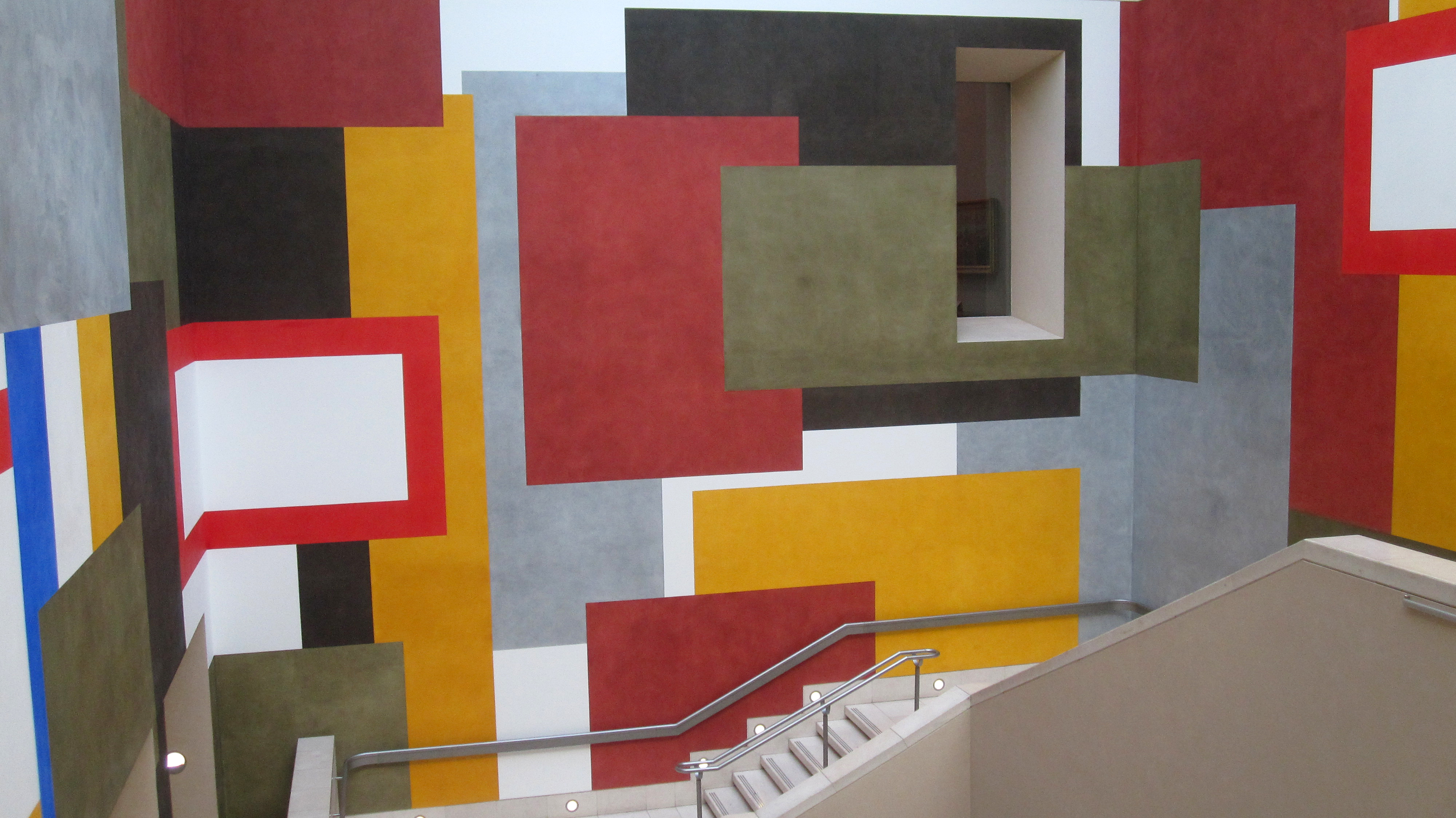
This mural was here before the renovation I think but still adds a great and a little unexpected sense of humanism to the building:

wall 1

wall 2


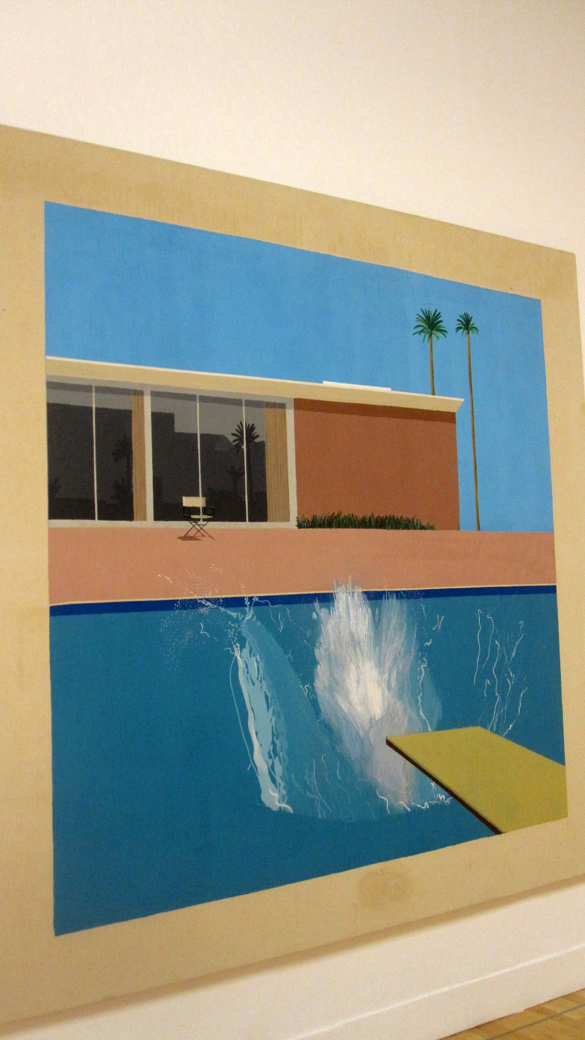
Genius idea. And now, onto the art itself. Each time I visit something different usually catches my eye, but there are a handful of regulars that always make me stop and stare. The principle one being ‘A Bigger Splash’ by David Hockney. I love the way he’s captured a moment after it has just happened. There is a perpetual sense of a motion drawing to end, a gesture in its last drag that is both futile and alluring. The composition is bodily boring and daringly cold.

hockney - a bigger splash


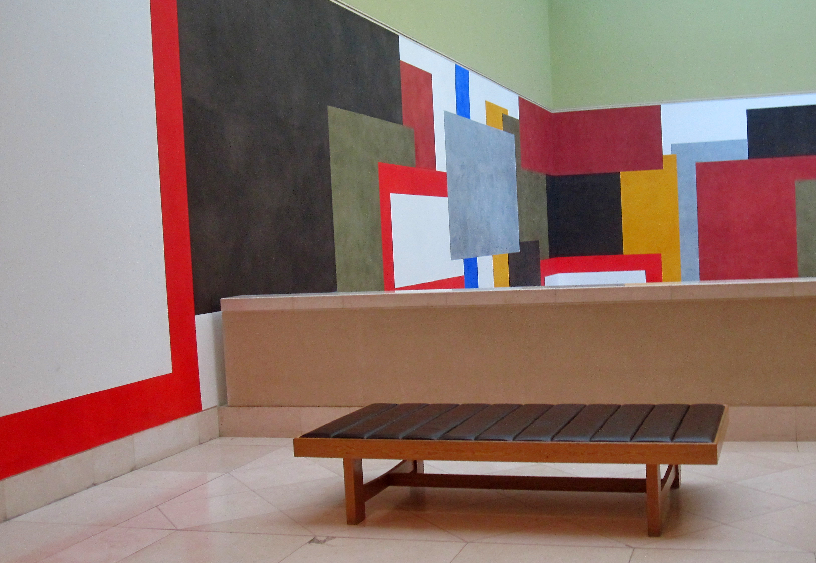
Howard hodgkin has again always been a favourite. That red just pops out with all the life that an inanimate object can ever project.

howard hodgekin


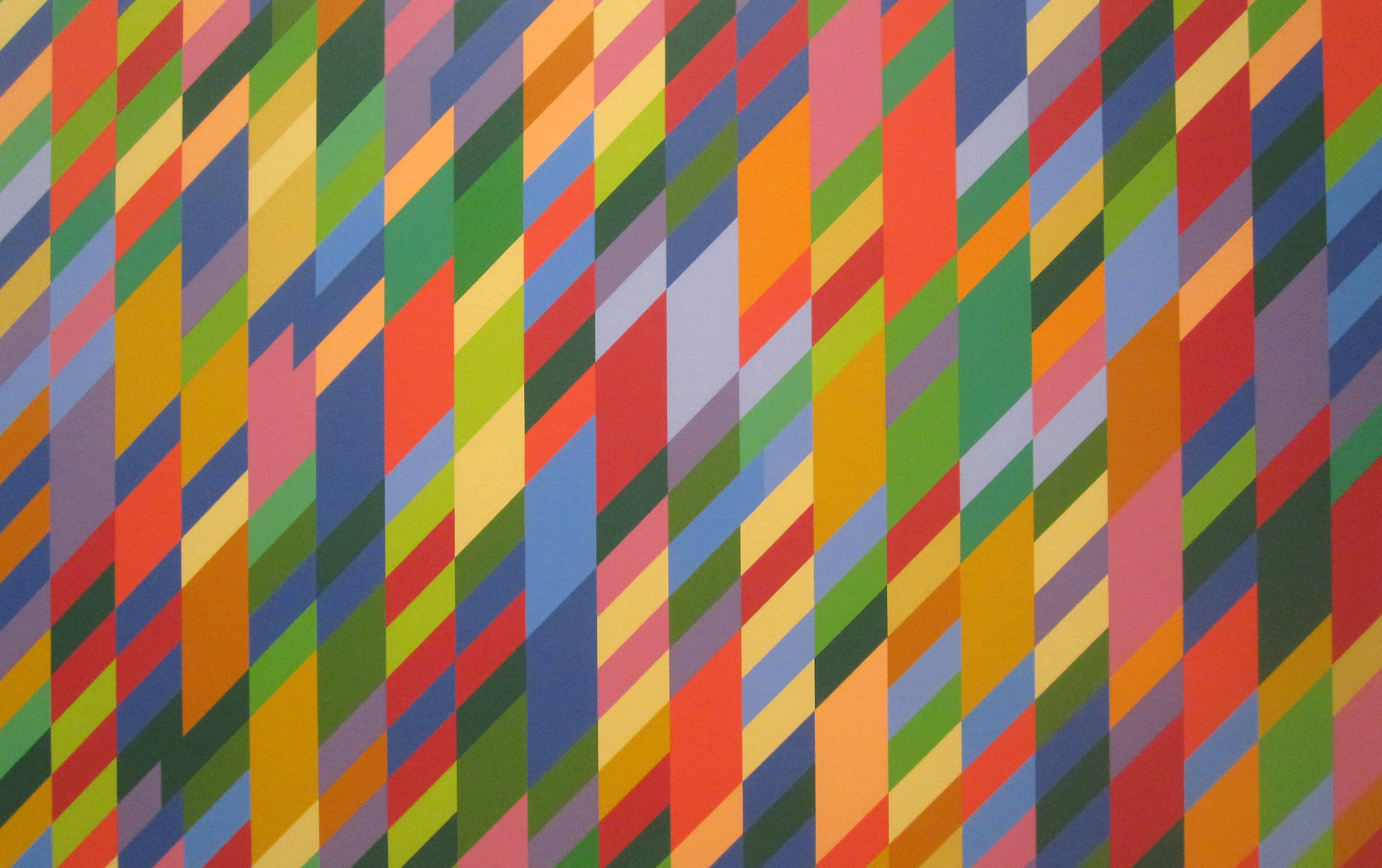
On to Bridget Riley, an Op-art legend. She sure knows how to manipulate the eye. I always feel like looking at one of her pieces is like having and eye-test. I love the way this piece, ‘Nataraja’, seems to come out towards the viewer.


bridget riley - nataraja


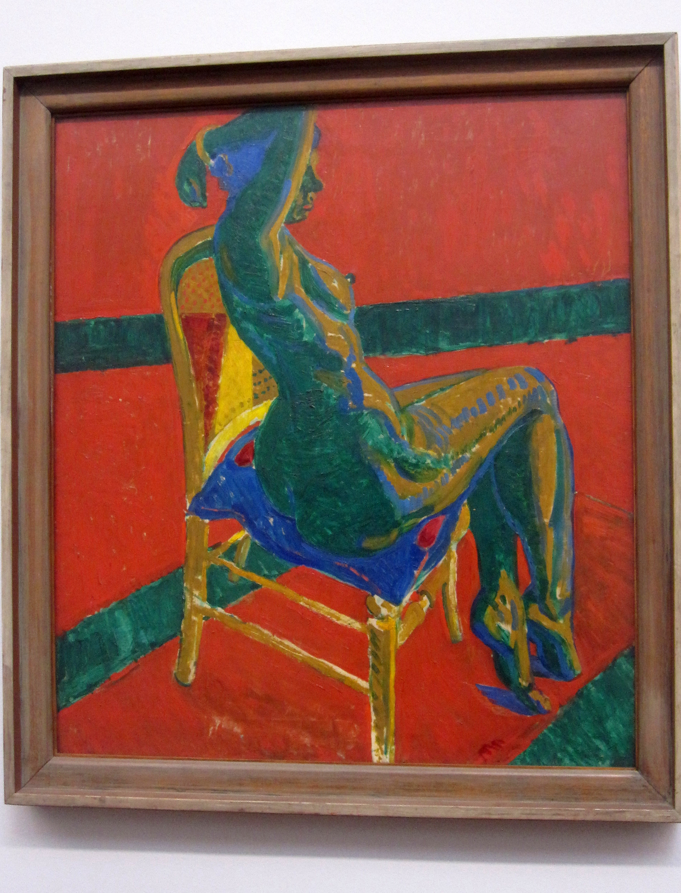
This nude by Matthew Smith is precisely the kind of drawing my art teacher at school used to show us before life-drawing class. A perfect example of how colours can be manipulated to create something that is while not a true representation, is still a true likeness.

mathew smith - nude, Fitzroy st no 1


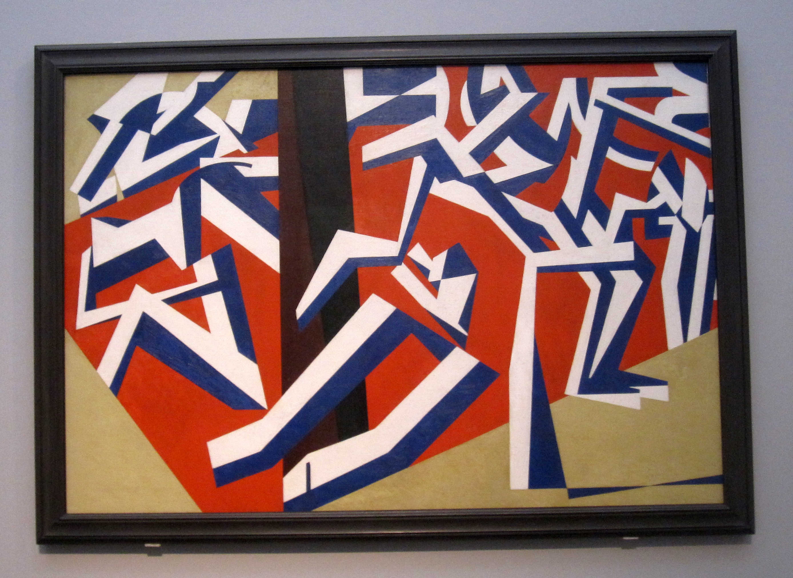
I’ve recently discovered this artist, David Bomberg. This work, ‘The Mud Bath’, reduces the human form to vague, geometric shapes that seem to be in constant movement.

david bomberg - the mudbath


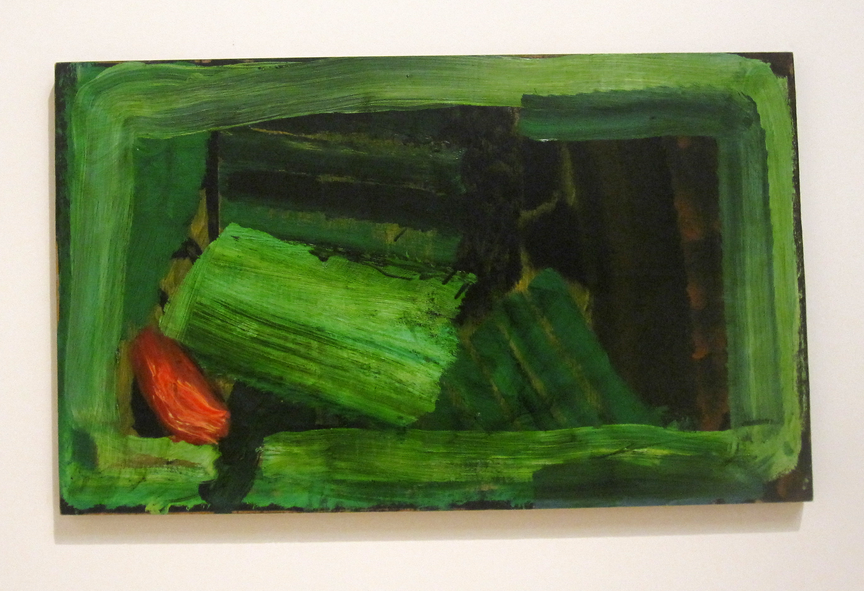
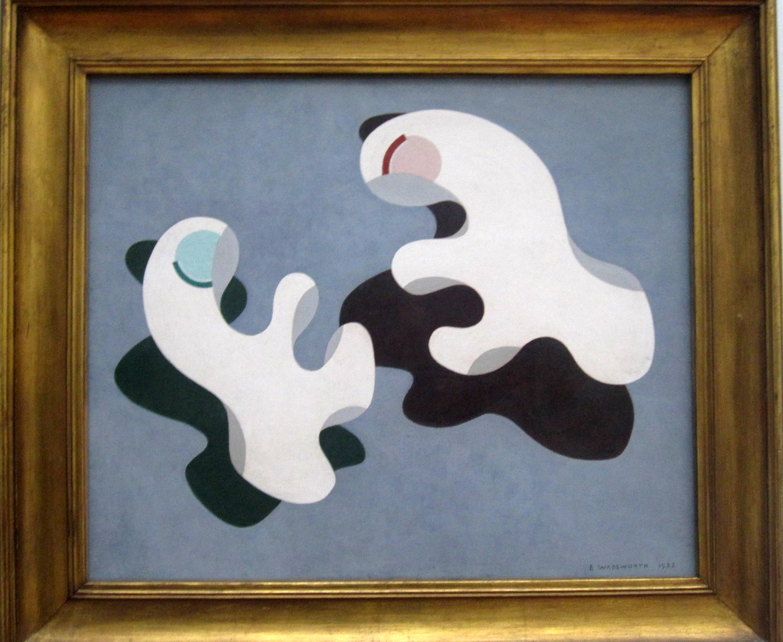
This rather small painting by Edward Wadsworth is by far not his most famous, but I quite like the secret interplay between the two suspended amorphous shapes.

edward wadsworth - dux et comes 1


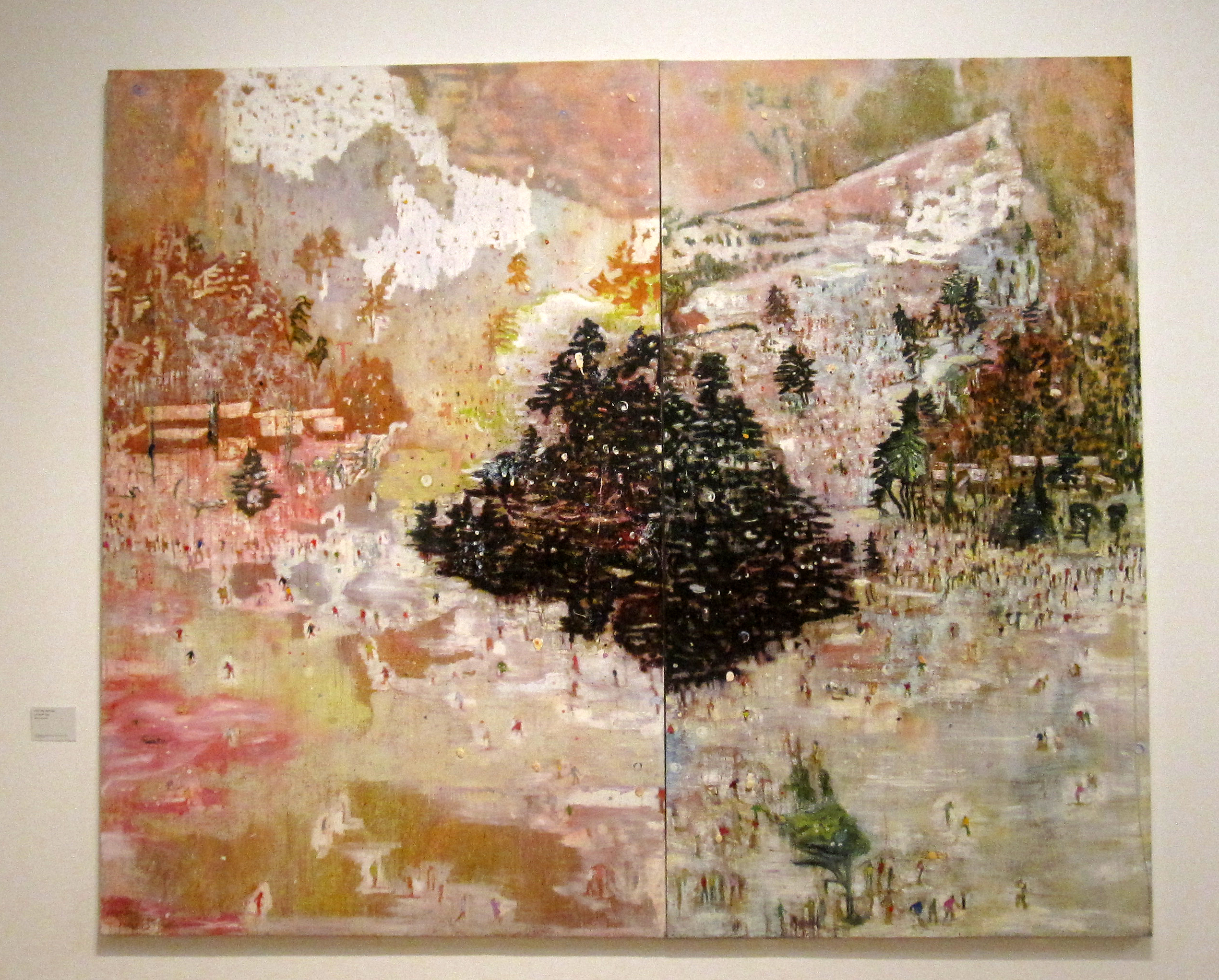
Peter Doig, ‘Ski Jacket’. Makes me of a friend who recently moved to Montreal, Canada.

peter doig - ski jacket


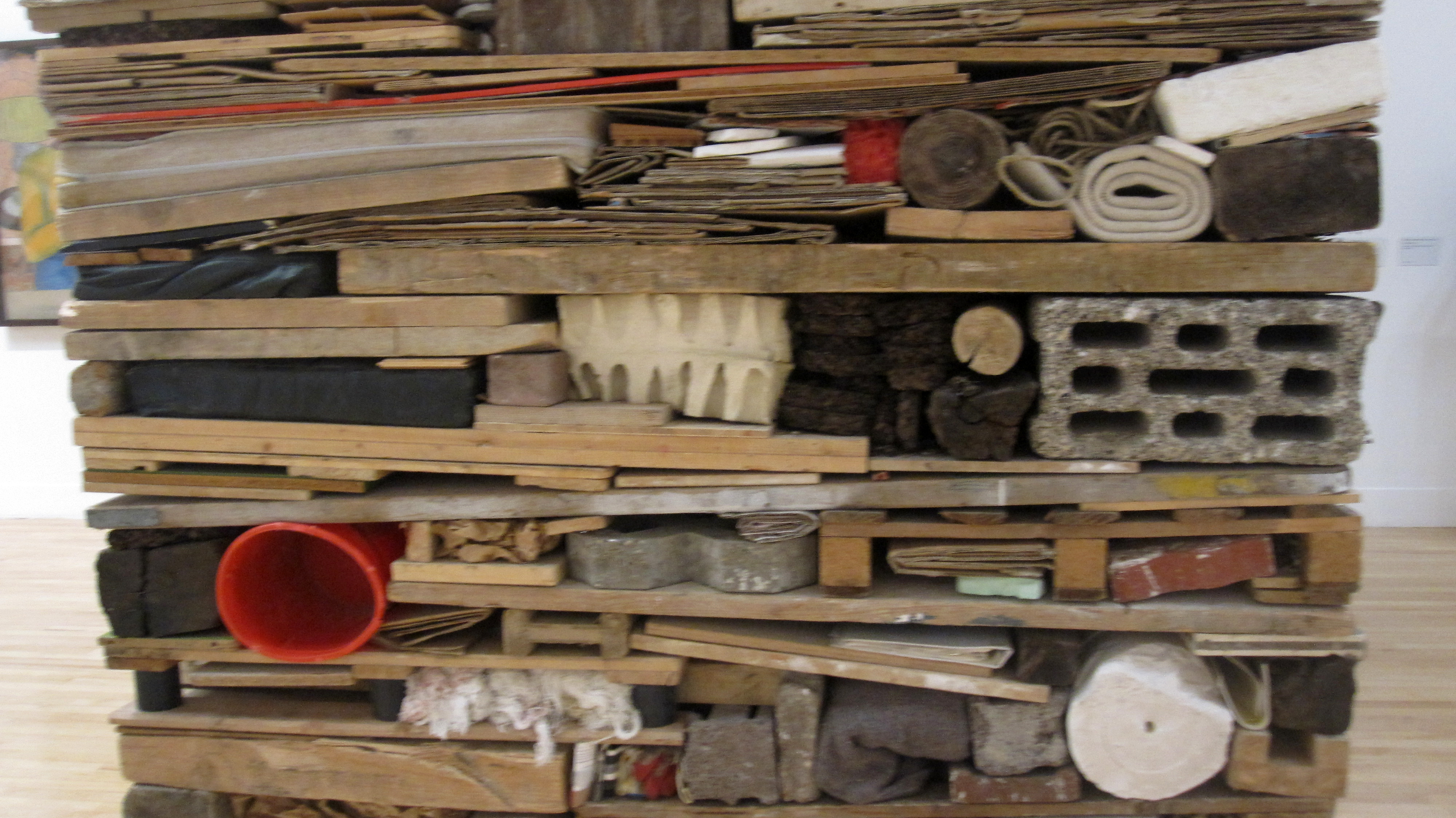
I’ll be honest; I usually find sculpture very hard to understand, let alone like. Tony Cragg‘s sculpture here, ‘stack’, has appealed to me on this occasion I think because it fulfils some OCD thing inside me to have everything slotted in together in perfectly fitting, compact shapes. He must be very good at packing for holidays! His sketches are worth a goggle as well.


tony cragg - stack


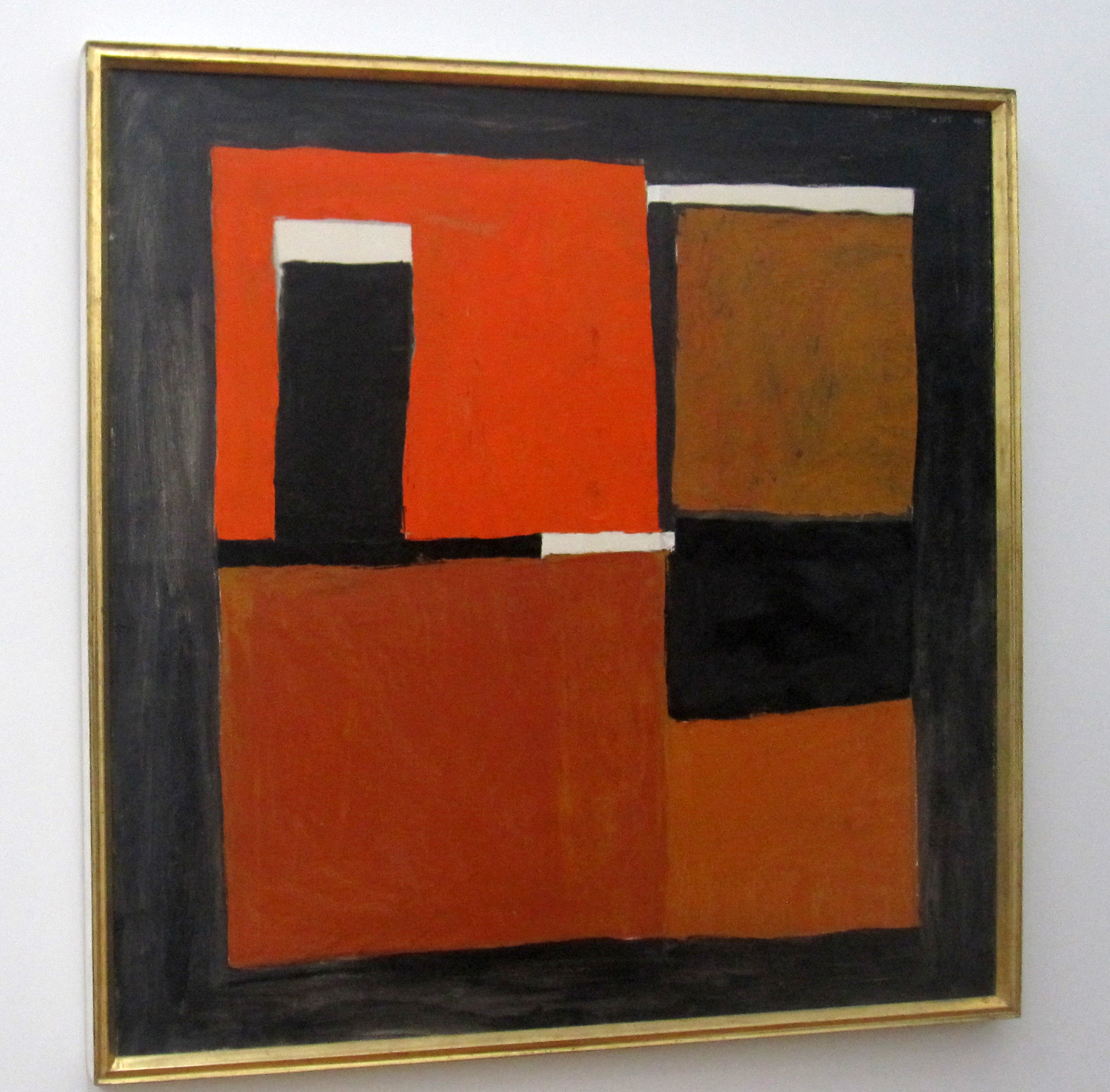
I found this composition by William Scott very calming.

william scott - orange, black and white composition


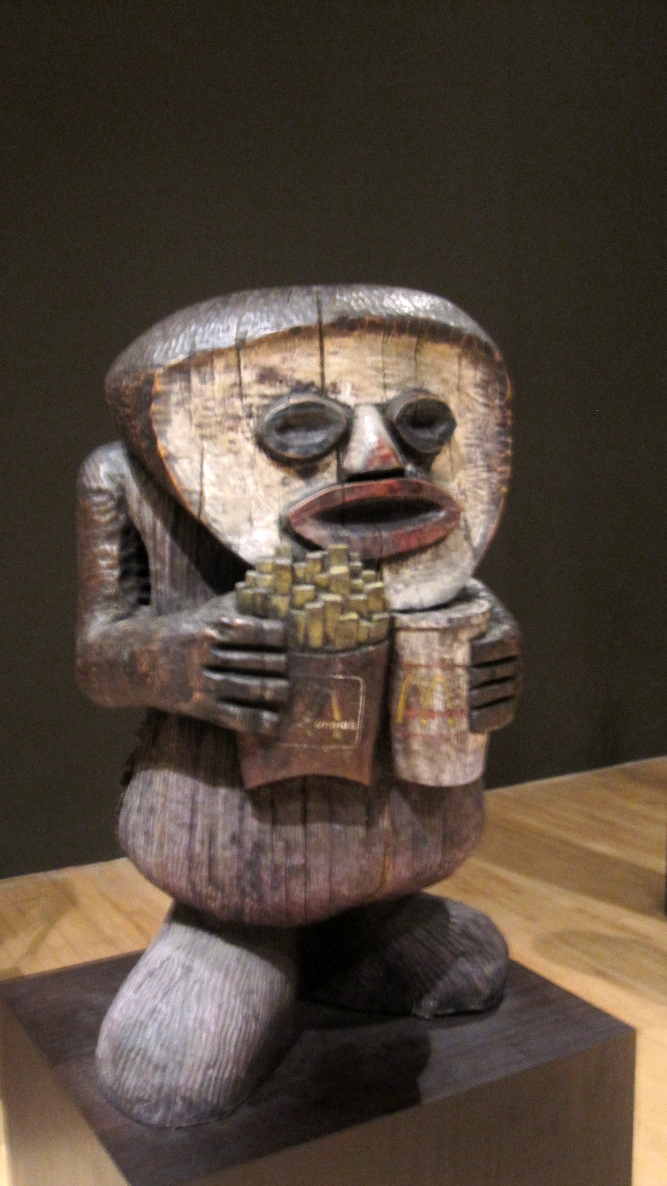
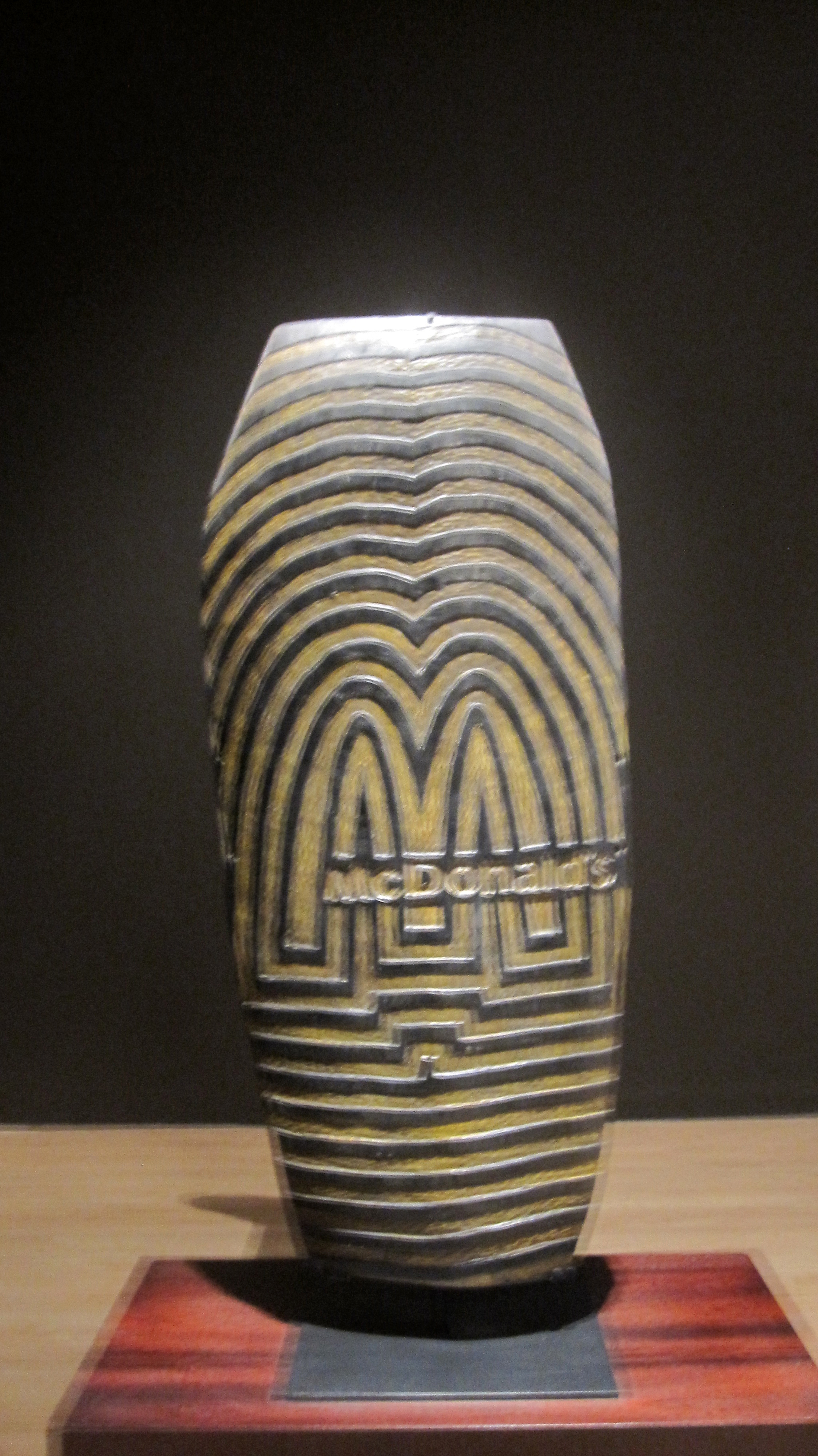
One of the larger works that took up a whole room was this installation by the Chapman brothers, entitled ‘The Chapman Family Collection.’ I really liked this piece. As you walk into the room, the lights are dimmed, its cosy and at the same time a little sinister feeling. You see several what appear to be wooden carvings from what you assume are tribal communities around the world. On closer inspection, there’s signs all is not as it should be. Ronald McDonald peers out at you through the gloom. ‘McDonalds’ is lovingly inscribed into a wooden shield. These objects are highlighting the superficiality of not own our contemporary lifestyles, but our inability of perceive things as they really are. It a simplified version of a lot of wider issues, yet sometimes the most simplistic messages are the most powerful.

the chapman family collection 1

the chapman family collection 2


Lastly, a question to you:

do you read the description first or look at the painting/sculpture first?!

Art Everywhere

….I will update my drawings project soon I promise, but for now I wanted to briefly mention ‘Art Everywhere’, a project started by Innocent Smoothie genius Richard Reed.

The basic idea: 22,000 poster sites, 57 works of art, putting art in place of advertisements all over the country. At first I thought this was purely just a London-based project but was glad to learn it’s nationwide! Who wouldn’t rather see an interesting painting or photograph at your local bus stop than a dull advert for EE, Fanta, or Sky you’ve seen a million times before??

I think this a great idea because it makes art free and incredibly easy to access. It also brightens up the place, a Freud, Hodgkin or Hockney is surely more aesthetically pleasing than any advert could be?!

A glance at some of the chosen artworks:

20-junglequeen2hewlocke-jpg-230x294 Lowry-230x179 man-s-head-self-portrait-19631-230x233 Hockney-230x227 Knights-Portrait-of-a-Young-Woman--230x290 T07618_10-230x290 Turner-Temeraire-230x171 T05771_10-230x210 pardaxin-230x187


One of mine (and Britain’s) favourite paintings, The Fighting Temeraire is featured, and in Victoria Station, where I often work. Keep a look out for the others….or go to the website to see where they all are: Art Everywhere.

My only complaint: that there aren’t more, I would have liked to see every advert in London covered for a while!